Overview: Review Manager Page
The default view for the Review Manager page displays a list of open reviews in the platform where you are the reviewer of the review. Depending on your security permissions you have associated with your account you may be able to see reviews for all employees within your downline, or all employees within your organisation.
Visibility is configured at a review level, so you may not have visibility of some review types even if they are associated with your direct reports, this is particularly the case if the review is considered sensitive in nature.
This lesson we will look at the different aspects of the Review Manager page which can help you to manage reviews in the platform best.
Summary Grid
The grid will display a list of open reviews. You can open any of the reviews below by clicking on the title of the review to the far left of the row.

The grid displays other high level information including the name of the Reviewee and the Reviewer.
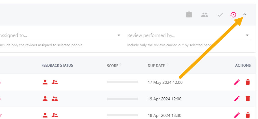
The icons under the Feedback Status area pertain to a different individuals who have feedback questions associated with the review. Red icons indicate that the feedback questions have not been submitted, green icons indicate that the responses to the feedback questions have been shared. If you hover over any of the icons it will display further information including who is fulfilling that role.
The Score progress bar will populate once the Reviewer has responded to their feedback questions – this is calculated based on the weighting for the scored questions, and potentially any objectives marked as complete within the review.
Depending on what permissions are associated with your account, you can delete or edit information in the review. Editing the review will allow you to change the review’s due date or title. The edit (pencil) and delete (trash can) icons can be found to the right of the grid.
Filters
Select chevron to the far right of the filters bar to reveal the filters. Here you can filter reviews based on the Title, the type of review (Review Template), the Reviewee (Assigned to), and the Reviewer (Review Performed By).

Interactive Buttons
The buttons with the colourful icons above the filter bar are interactive and will become usable once a review falls in to any of these categories. This makes it easier to filter down the reviews to those that are overdue, due within the next 7 days etc. These buttons can be used in conjunction with the filter bar.

Filter Bar Buttons
There are a number of different buttons in the filter bar which can help you identify certain types of reviews. The Secure icon filters to display reviews which are considered sensitive in nature i.e wellbeing reviews, exit interviews.
The people icon (depending on what security permissions are associated with your account) displays either reviews within your team, your downline, or all reviews within your organisation. This will be apparent when you hover over the button.
The tick icon will include completed reviews in your search – completed reviews include a green tick icon to the left of the screen. Remember that the default view for this page does not include completed reviews.
The circular arrow icon will reset any filters which you have applied, including those set by the interactive buttons.


